nipt24
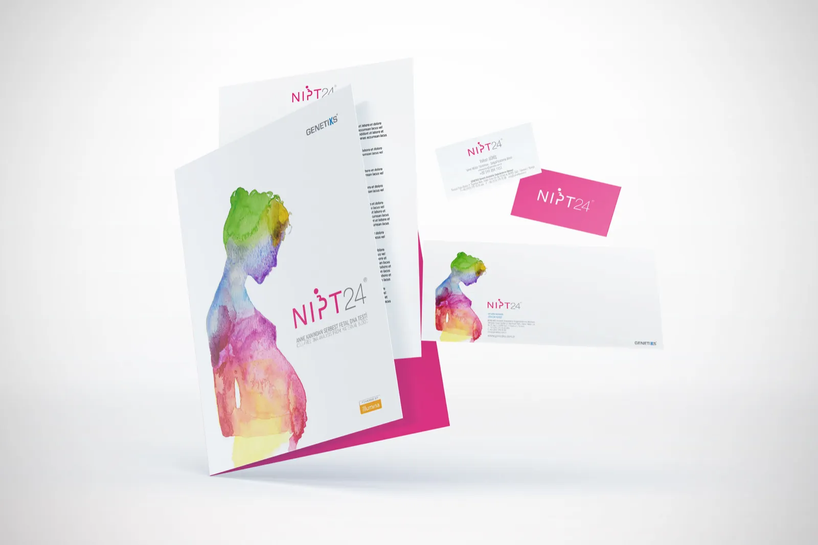
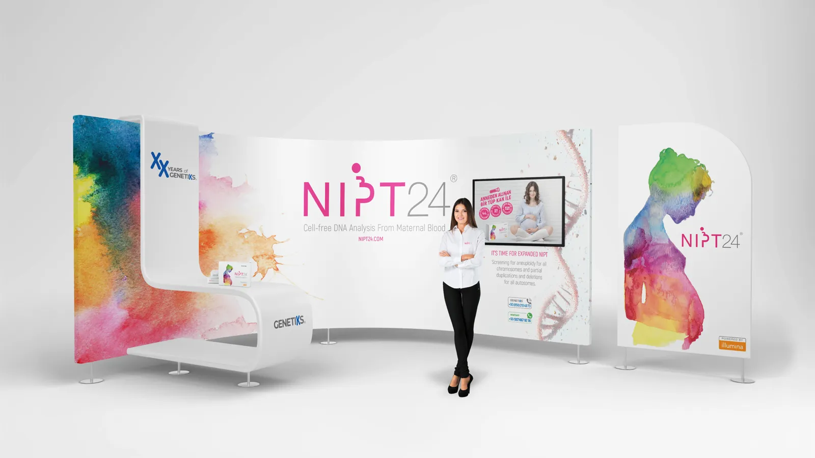
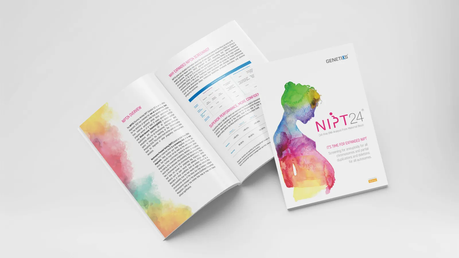
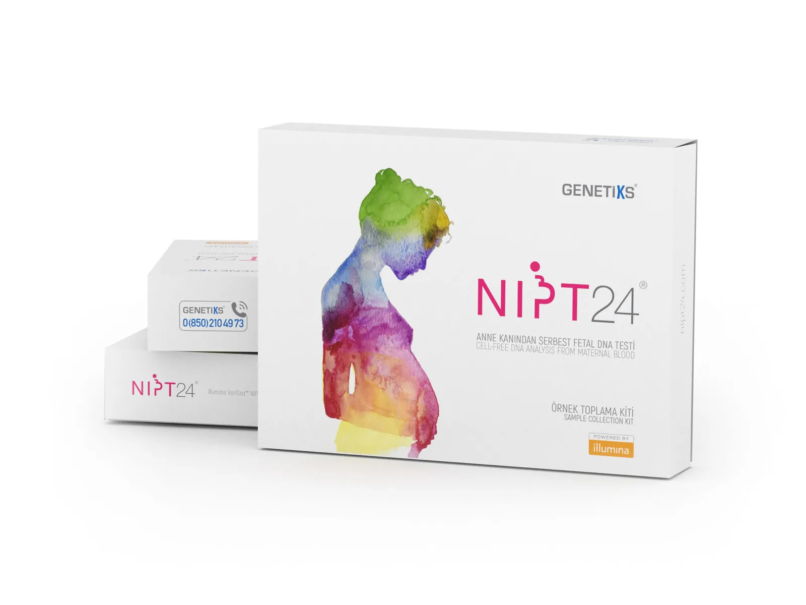
Brand identity, visual system and packaging for NIPT24®, a non-invasive prenatal test that reads cell-free fetal DNA from the mother’s blood.
the goal
Communicate a comprehensive genetic screening that covers all 23 chromosomes while feeling warm, trustworthy and caring to expectant parents: complex medical technology in a supportive visual language.
the p
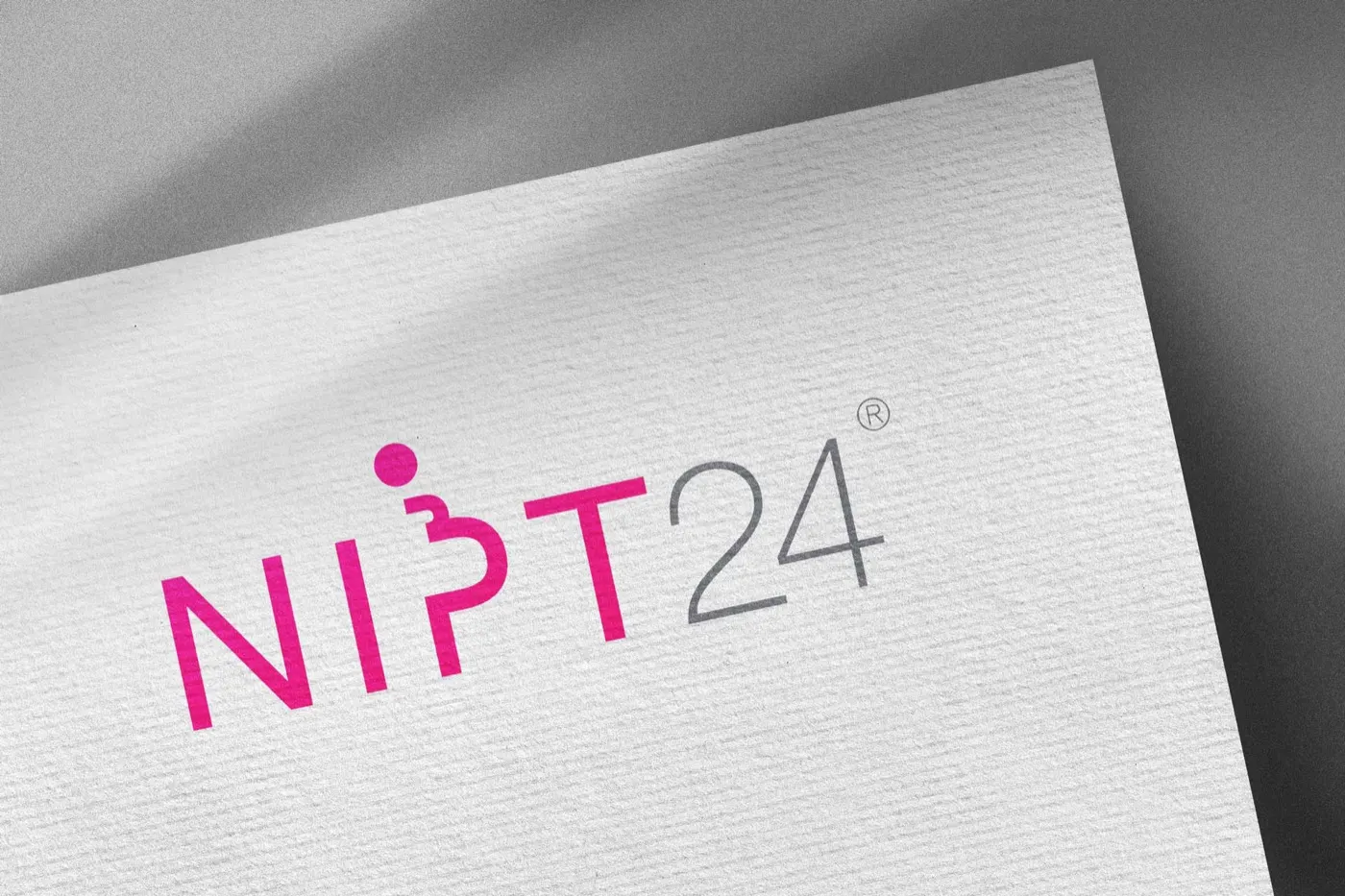
The P in the logotype is drawn as the silhouette of a pregnant woman, an immediate human link to the people the test is for.
the watercolour
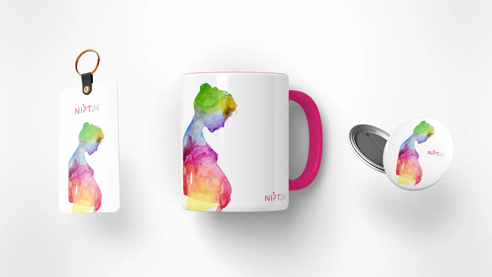
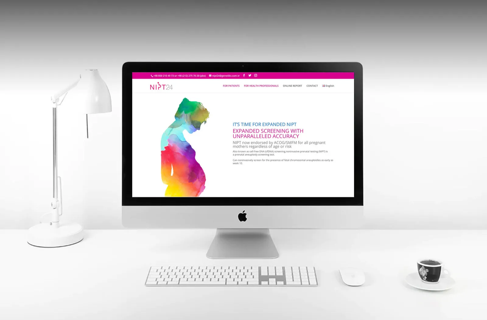
The key visual is a watercolour of a pregnant woman in soft greens, pinks and yellows. The blending colours evoke genetic material merging and the life-giving world inside the mother.